AI-Powered Design System
I built a system that lets anyone on the team generate on-brand prototypes with AI. Prototyping went from weeks to hours.
The Result
Prototyping went from weeks to hours — and stopped being a design-only activity
PMs and engineers can now build on-brand, interactive prototypes independently. Design standards are held at the system level, so output stays consistent no matter who builds it.
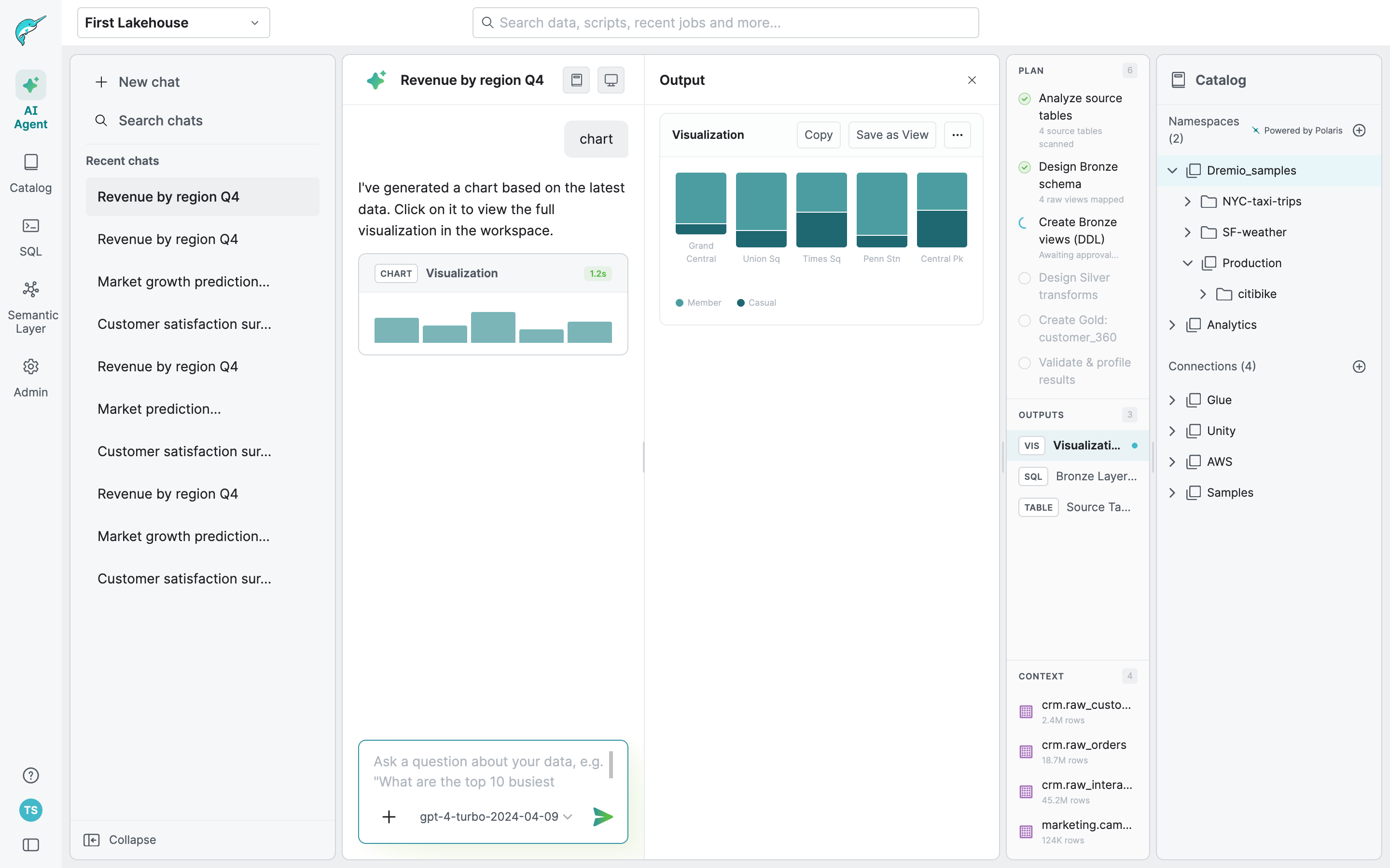
Our PM spent two hours one evening building a Get Started flow for the AI agent — including Add Data and Explore with Sample Data. She presented it to the CTO the next morning.
The rest of this case study is password protected
Enter the password to read the full process.
Incorrect password. Try again.
The Problem
Demand for prototypes consistently outpaced what design could produce
As Dremio's AI agent work accelerated, bringing AI into the workflow seemed like the obvious fix. But early attempts produced output that was visually inconsistent and hard to build on.
The AI wasn't the problem. Our design system was. It had been built by a small team who shared an implicit understanding of how everything worked. That knowledge lived in people's heads, not in the system. Component names were inconsistent. Descriptions were almost entirely absent. What worked for humans who already knew the system was unreadable to an AI trying to use it.
left nav
Status pills
radio&checkbox with text
Form/ Field
Scroll Bar
The Real Challenge
Two problems that had to be solved in order
The first was making the design system legible to AI. Without this, every prototype AI generated would need heavy correction and the effort would never get easier over time.
The second was harder. Dremio's AI agent UI was still actively changing. Any system we built needed to hold design standards firm while leaving teams room to explore. Too rigid and it would block the experimentation the product needed. Too loose and AI output would drift from our visual language.
The AI Agent UI went through significant structural changes between these two versions. The layout, navigation, and interaction patterns all shifted — which meant any component system built too early would need to be rebuilt from scratch. This is why making the design system legible first, before building on top of it, was the only sequencing that made sense.
The Strategy
Sequence first, build second
The key decision was sequencing. Building a prototyping system before the underlying library was legible to AI would have meant building on sand. Any output would require constant correction and nothing would get easier over time.
Phase 1 — Make the system readable
Get the design system to a state where AI could interpret it correctly, with consistent naming, clear descriptions, and documented variant usage across all components.
Phase 2 — Build modular structure on top
Layer a modular prototyping system on that foundation, where design standards are enforced by architecture rather than by someone reviewing every output.
How It Came Together
From implicit knowledge to a system anyone can use
Making the system legible
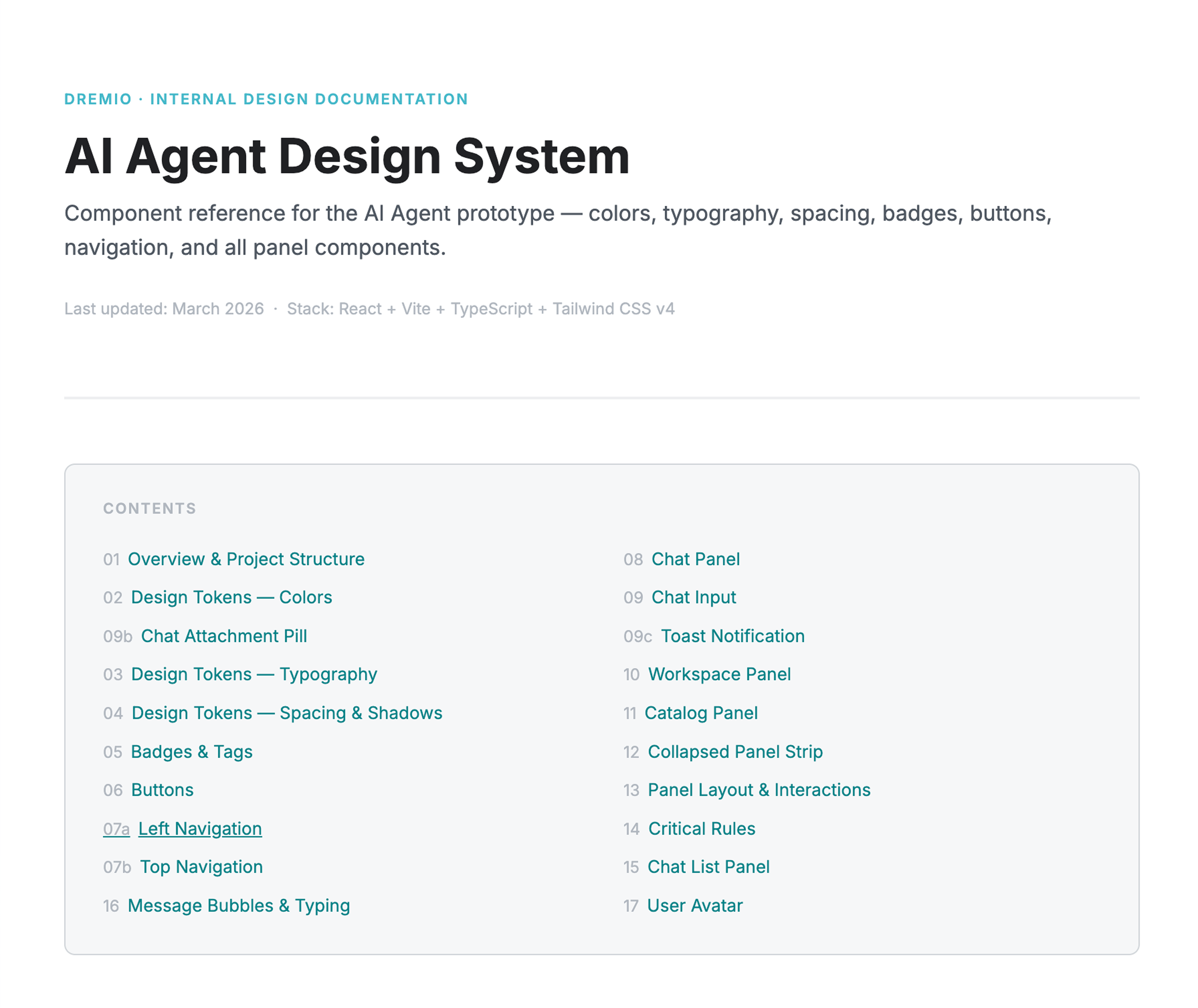
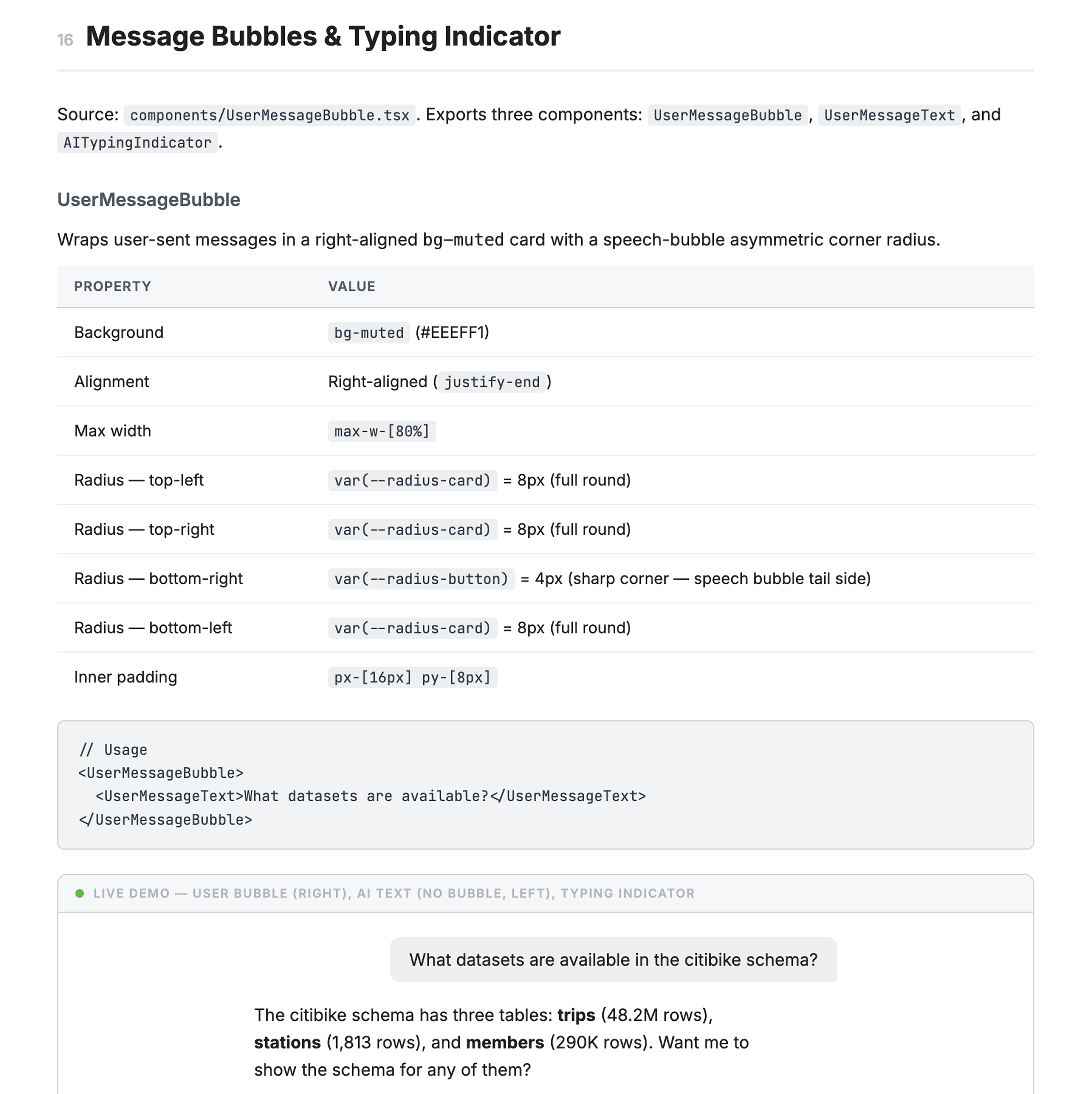
I used Claude Code with Figma MCP to read the library the way AI would, then generate naming and description proposals for all 96 components. I reviewed and corrected where the AI had misread intent, then pushed the updated metadata back into Figma. Every component now has a consistent name, a clear description, and documented variant usage.
I also built an interactive visual reference alongside it, similar to an engineering storybook, so anyone on the team could see what existed and how to use it before building.
Building the modular system
The only starting point for the AI agent UI was a rough Claude Code prototype, functional in structure but far from our visual standards. I brought it into Figma to align it with our design language, then rebuilt it in Figma Make, validating component fidelity and layering in flows that other teams could use as a starting point for their own exploration.
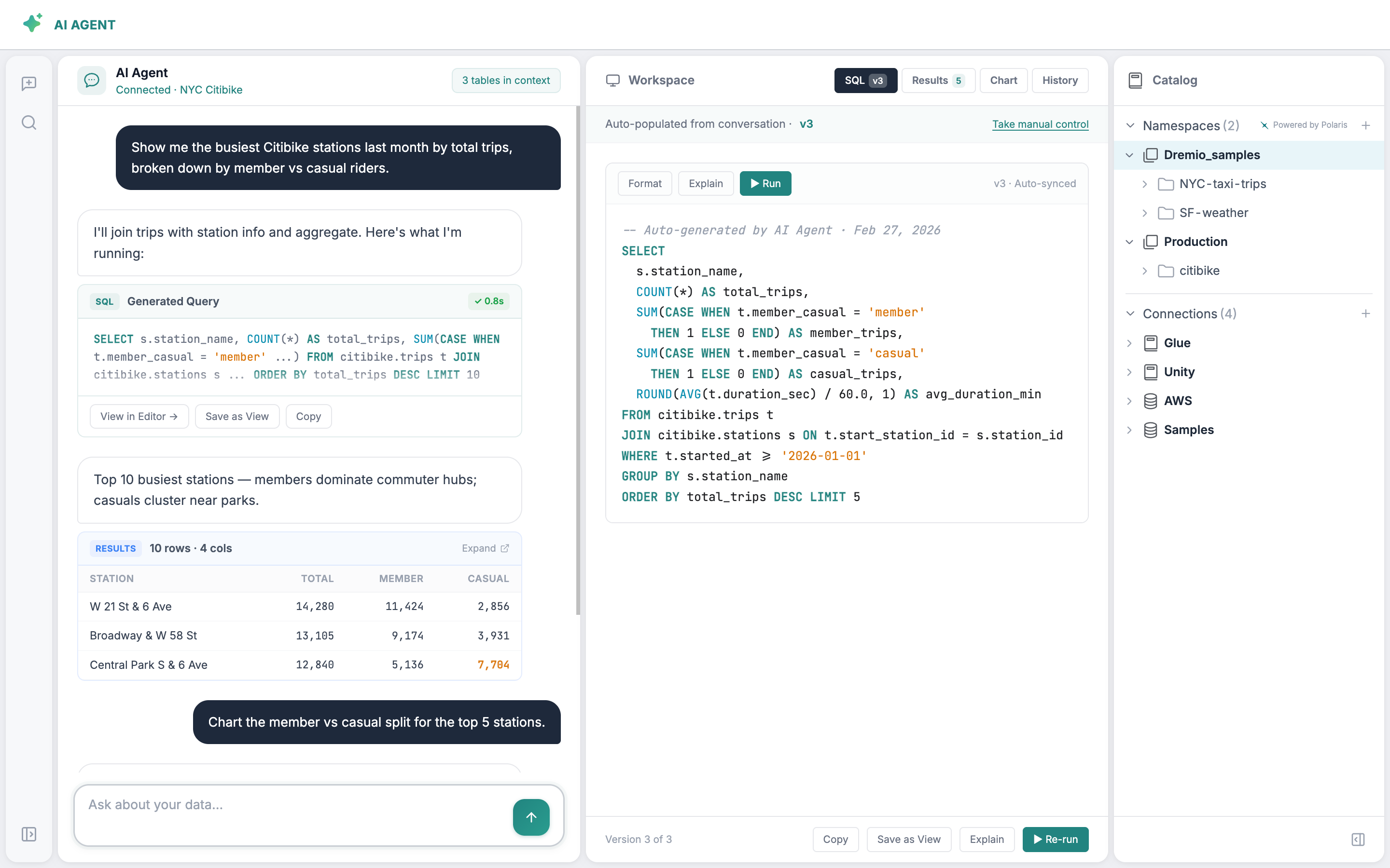
Once the prototype was solid, I broke it down by UI structure rather than by feature flow. Each panel became its own module, with documented elements, their variants, and their built-in interactions. The Chat panel, for example, contains the input field, user message bubbles, AI response formats, tool call states, and every result type AI can generate: datasets, SQL, charts, lineage, wikis, descriptions, and more.
This meant each module shipped with enough interactive logic that someone could pick it up and start building immediately without having to wire everything from scratch. It also made future updates much more contained. Changing how a result type looks or behaves only touches one place.
The decision to build the complete prototype first and modularize after was deliberate. Designing for modularity upfront, before the interactions were validated, would have meant optimizing structure before we knew what the structure should be.
The Impact
Design is no longer the bottleneck
Anyone can now build on-brand prototypes independently, and the output is consistent because the system enforces it, not because a designer reviewed it.
The PM's CTO moment was the clearest sign it was working. But the more meaningful shift was structural: we went from design creating screens to design defining the system that creates them.
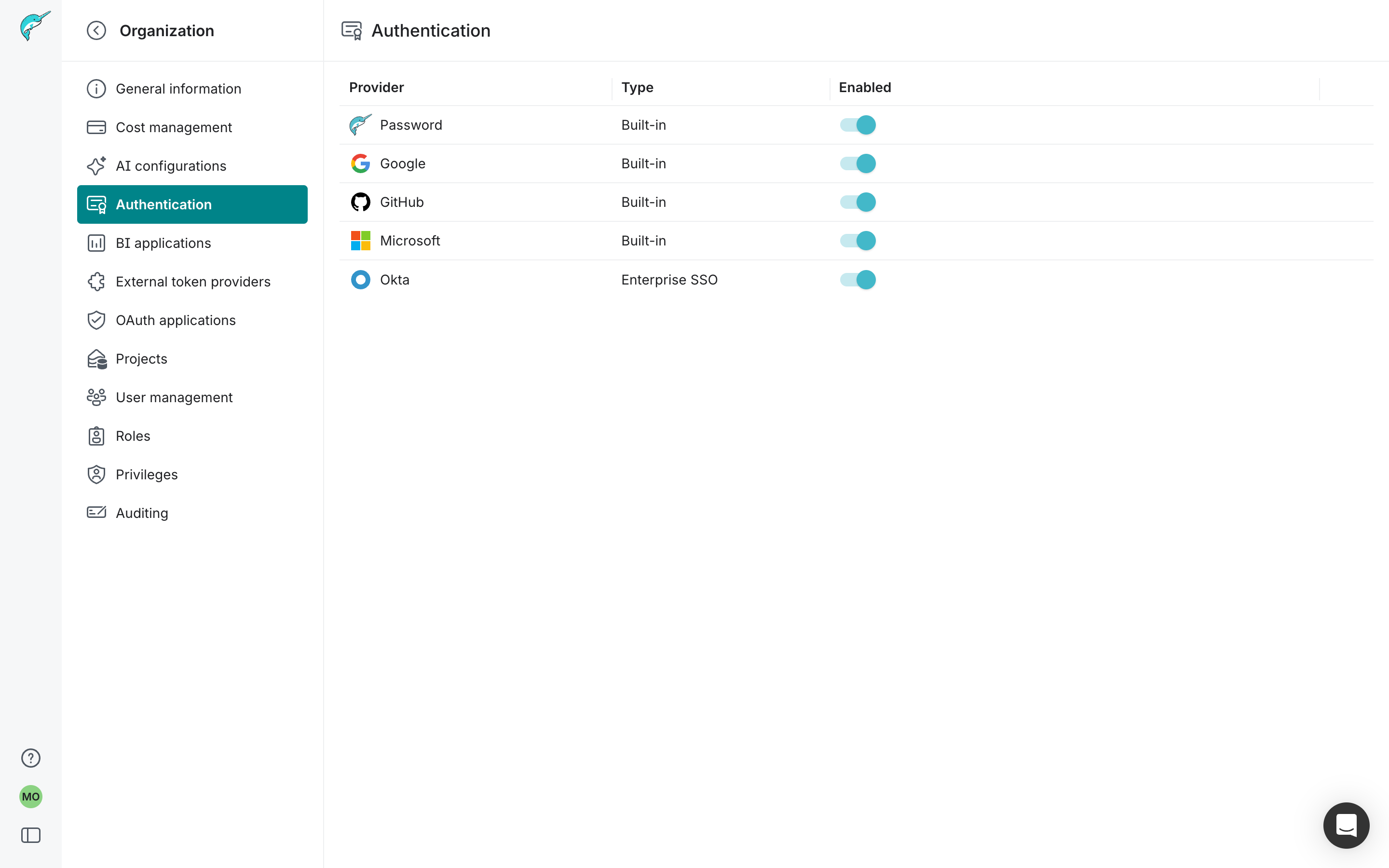
Engineer-built · Authentication settings · Reviewed by design
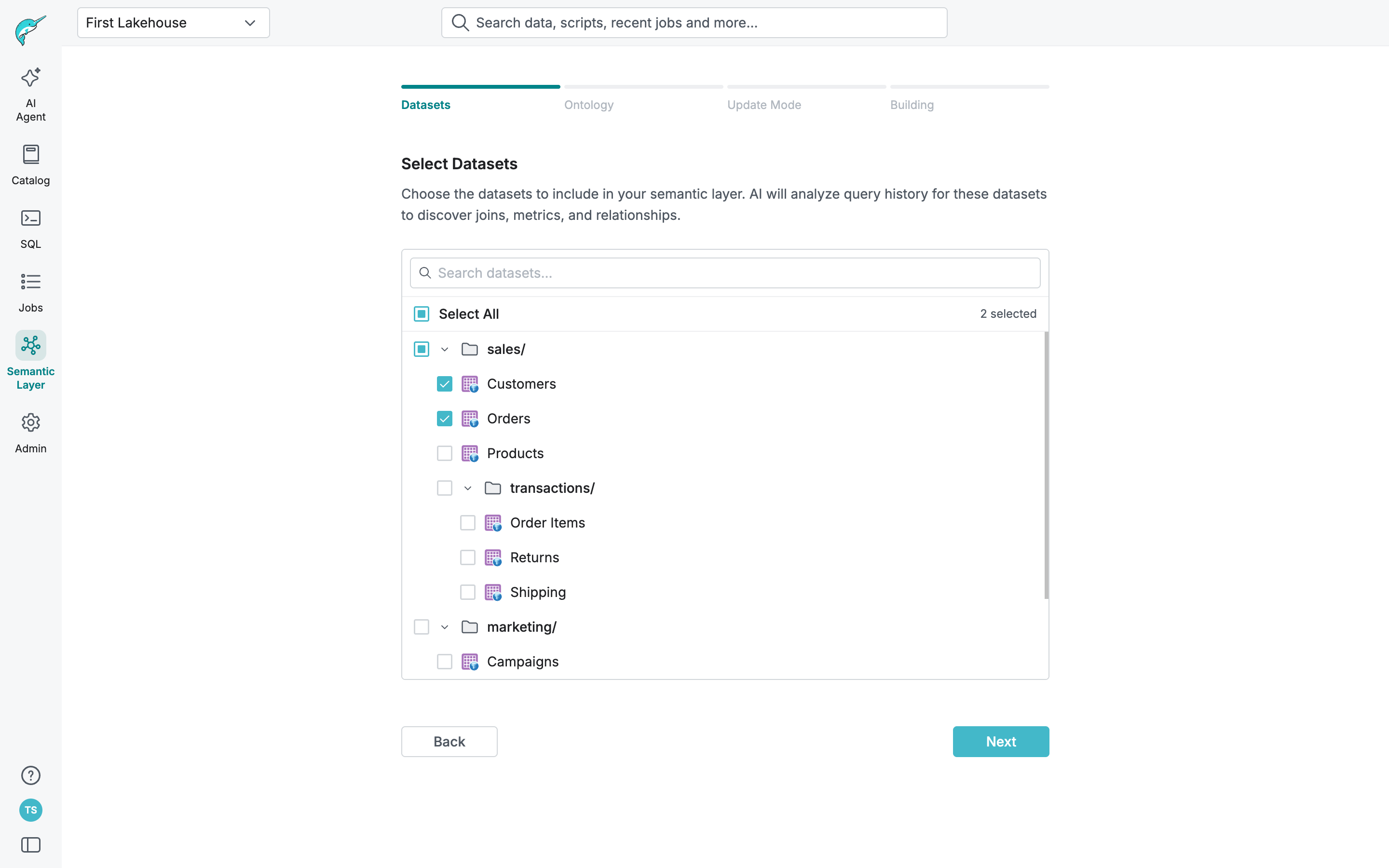
PM-built · Semantic Layer setup flow · Reviewed by design
What I Took Away
The hardest call was doing the foundation work first when the pressure was to move fast on visible product work. Getting that sequence right was what made everything else possible.
What's Next
Expanding the module library and building a process to keep the system in sync as the product continues to change.